Photos:
Before we go on to the JP version, here is the regular, discontinued US version:
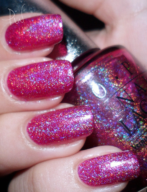
Vibrant, super saturated fuchsia. A very red based linear holo.
Now, the Japanese version:
(Click to enlarge)

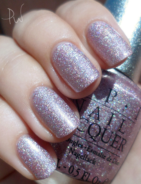
I do like it, but it's a lot pinker in real life than what I expected. These photos make it look more purple. The optimum number of coats is two. I put on three, thinking that it would make the effect more intense. It simply looks darker and opaque, and lost quite a bit of its charm. So two coats it is next time, a little sheer but not too much so, and it looks a lot more flattering on my skintone that way.
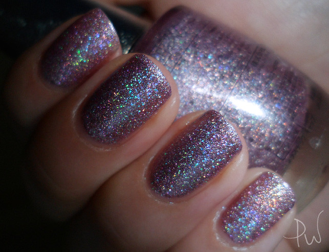
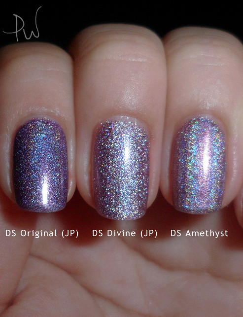
Here are comparisons (so you can also see the finish on DS Original JP):
(Click to enlarge)

Amazing pictures!!
ReplyDeleteThis is so amazing. The JP versions of the DS polishes look to have a similar holo effect as the china glaze kaleidoscope line? larger holographic particles.
ReplyDelete